Back in November I flew to Ireland to take part in a course in Graphic Design in Film Making by Annie Atkins and I have absolutely loved problem solving my own brief in the little snippets of time around work and being a mum. Thank you Annie for all your guidance and support! I will certainly be making more props from books I am reading 📚
So, I present to you my first set of film props! Ok so they weren’t in the actual film, but this is a self initiated project I had wanted to do for a long time.
Based on the book All the Light We Cannot See by Anthony Doerr. I have explored Marie-Laure's character and have imagined some pieces relevant to her part in the wonderful story.
⚠️ Spoiler alerts below if you haven't read the book! ⚠️
Urgent Message
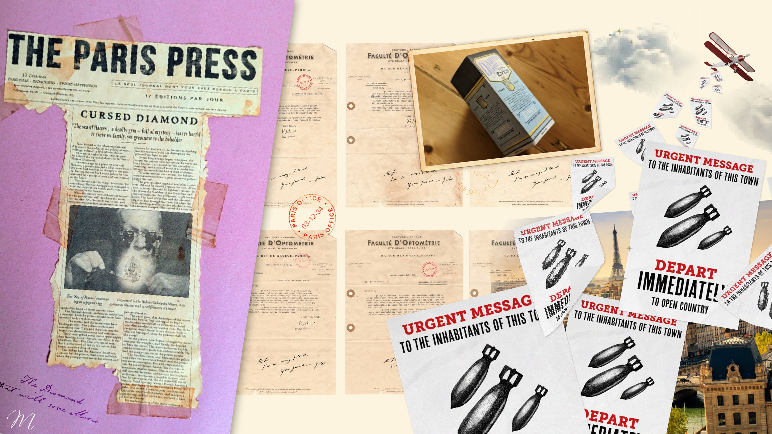
The book opens in 1944, with a flyer which comes down from a passing aeroplane warning the people below in Saint-Malo to leave the city as it is about to be bombed. I have recreated it here with the idea of a letterpressed flyer and an illustration of bombs, I imagine in the book this would be in French, but for a film sake I went with English.
I researched the type of illustrations which would be used by looking through a catalogue on Victorian letter press illustrations. Using a 0.1 fine liner I recreated an etching style bomb with various cross hatching.
I distressed the type by printing set type, rubbing with sandpaper, scanning back in and then distorting more in Photoshop.


My reference was a bill with a mix of typefaces and an etched illustrations.
Paris Press
Marie-Laure is a blind girl who unbeknownst to her lost her sight due to a cursed diamond.
I have created a newspaper clipping based around the legend of the diamond, an actual extract of the book is in there!
To create this I used my reference piewce and closely imitated the typesetting and typefaces. I used a similar technique to distort the letters, by creating a texture with ink and a rag and the clipping pathing it to the ‘THE PARIS PRESS’ After typesetting I went though then distorted the text even more in Photoshop. I printed 10 sheets of this, tea stained with various amounts of tea and left them to dry, to see how aged I’d like the prop to look.
I was given a top tip on aging the sellotape! Brown permanent marker and a bit of ruffling – thanks Annie.
I liked the way scrapbook paper can sometimes fade in the light, I had some old paper left from a scrap book I had in primary school which was nicely sun bleached, it was the perfect backdrop.
The photograph was three stock photos stitched together – it was lots of fun creating a wise old jeweller, holding the Diamond (quite rightly!) with tweezers away from his skin.
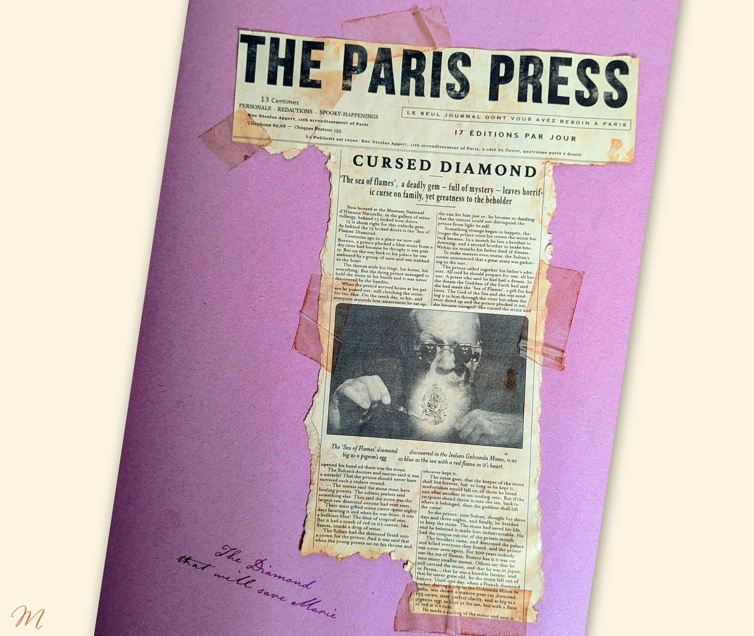
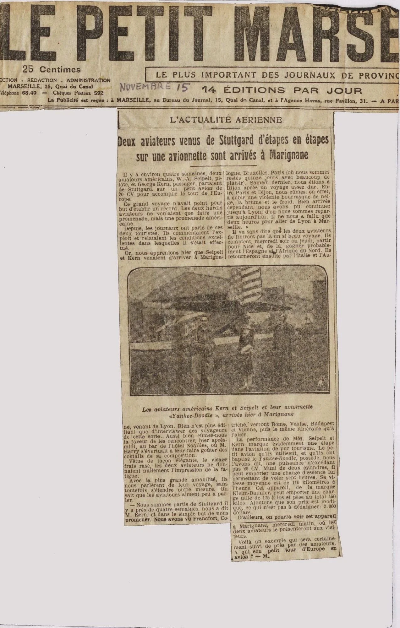
My reference was a French newspaper clipping. I looked closely at how the type was set across the masthead and tried to replicate as best I could. The very tight leading and columns were tricky! I had to take my typesetters hat off and go against my natural instincts.
Doctors Note
I imagined that Marie-Laure’s father would have had correspondence with an eye doctor while her sight was deteriorating so rapidly. This letter is the final one stating her sight was no longer viable and she was certified blind.
A big thank you to my good friend Megan, who is a real life eye surgeon, who copywrote a doctor's letter for me after I explained the story to her.
I created a letterhead from a reference piece, printed it and made over 20 tea stained letterhead sheets of paper. I tracked down a typewriter I thought I had lost 10 years ago and set to typing and re-typing the letter. This in my mind was to act as a hero piece, so in a film or on TV it could potentially be used over and over again – multiple copies would be needed and I needed to try and make them look as similar as possible – I have room for improvement!
I made sure I folded and ripped them all identically. I also made small hole protectors using a hole punch and craft paper. But to finish them all off I got a rubber stamp made with ‘Paris Office’ and the date 03-12-34.
The letter reads:
Dear Sir,
It was a pleasure to review your daughter Marie-Laure at my clinic last week. Unfortunately her vision has deteriorated significantly due to worsening cataracts in both eyes. She now meets the requirements to be registered as blind. I have informed the relevant authorities in order for her to receive any aid she may be entitled to.
I have prescribed her lubricating eye drops to keep her comfortable, these can be use as required. I look forward to seeing her again in 12 months time.
Your very truly,
DR.J.Arnaud.
There is also a hand written note at the bottom, which reads:
M-L,
I’m so sorry, I tried.
Your friend – Jules

My reference for the letter was this copper plate letter – from the 1930s France.
Diamond Drops
An eye drops box based on the Murine eye drops, I have stuck closely to the reference for this one as the typography was so beautiful. I made this with the intention there may be a flashback to M-L's life before she went blind, where she had discomfort and needed to treat that. These are also the eyedrops which are mentioned in the doctors letter.
I created the box by first making a new. Alongside this I developed some etching style illustrations on how to use the eyedrops.

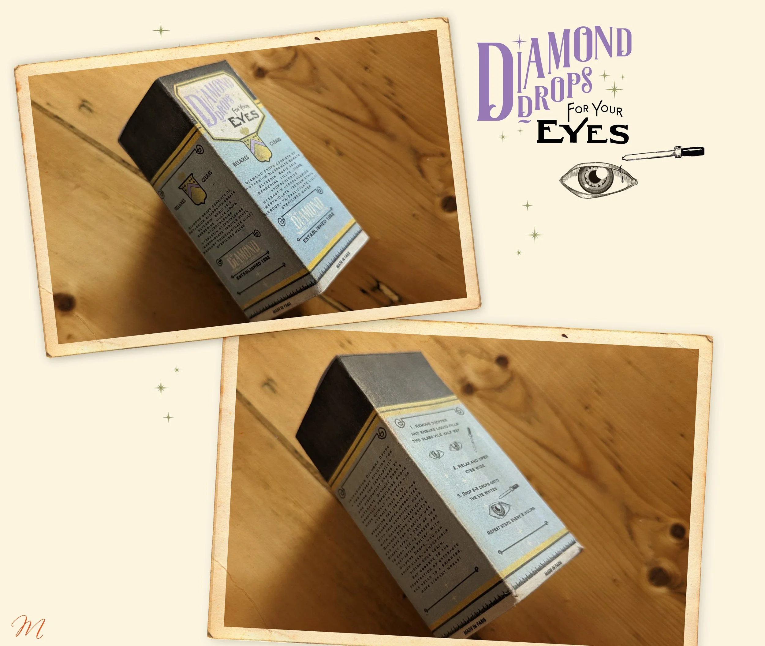
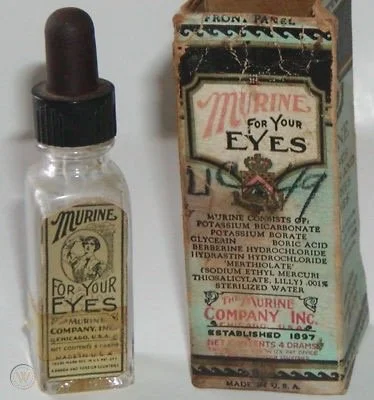
My reference for the eye drops was a bottle of Murine – the typography is so gorgeous!
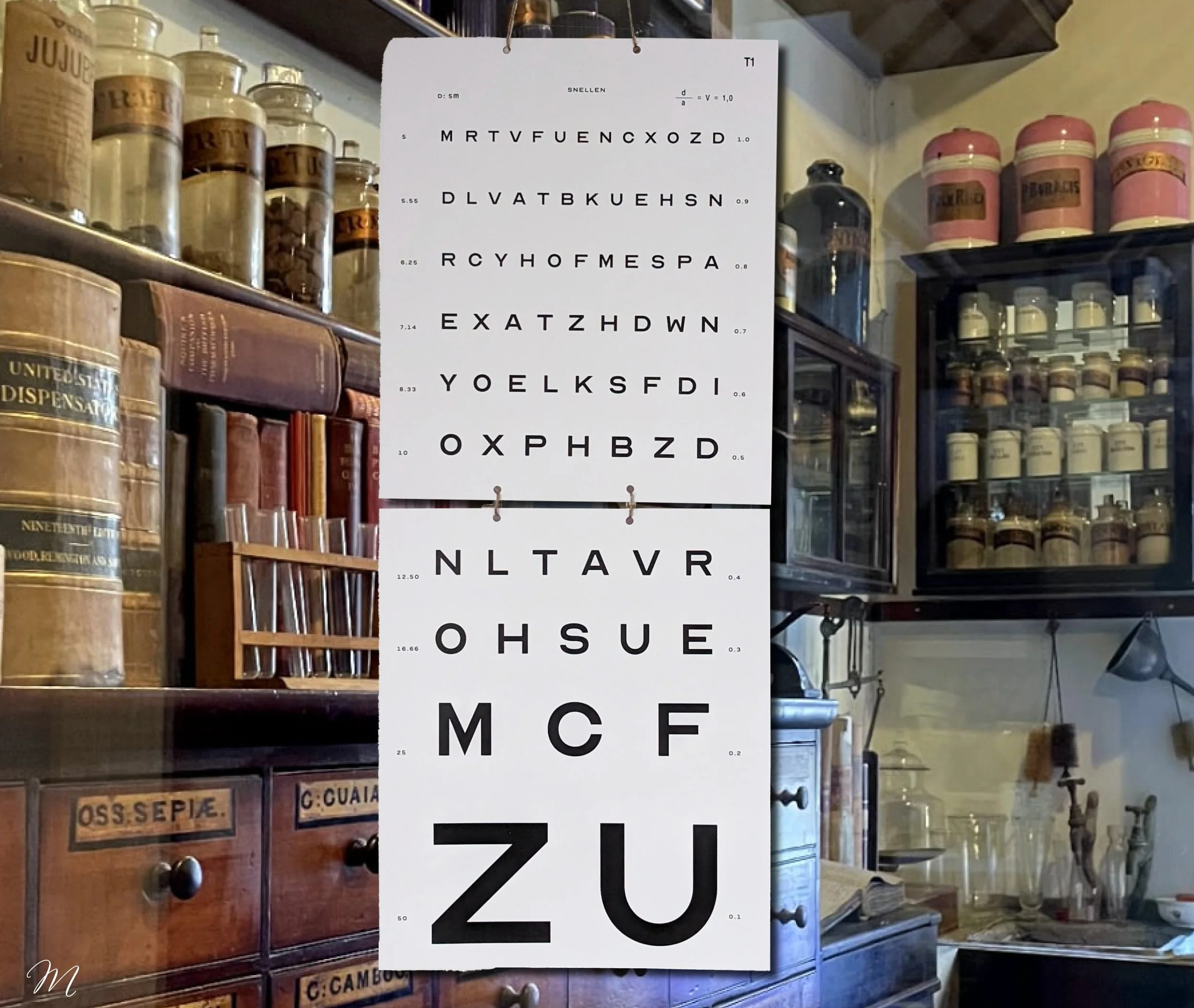
Snellen Chart
A Snellen chart, we all know what that is! I had found a brilliant typeface called Optician Sans but I changed the M to match my reference from the 1940s.
Thank you to Potts for printing that for me 🤓
Praise from the Author himself!

Excuse me while I fangirl.